Visualizing Social Network - Part 1
An idea is worthless unless implemented right? You can have all the data in the world but if you can't articulate it or visualize it for others to understand, then it's really just another data in your data warehouse.
The last couple of months me and my colleagues were working on social network. Basically trying to understand how the subscribers are interconnected and identifying who are the influencers for targeted marketing - or so we thought that's how it should be.
Business justification aside - it was an interesting topic to dive into. After a few days, we managed to come up with our edge and node list, and later ran a few centrality algorithms to measure each individual within that network. Specifically, we were measuring:
I guess it really depends on what you want to do with it. Are you simply just demonstrating an idea? A one-off presentation? Or maybe have them shown in a dashboard?
For us it was all of the above.
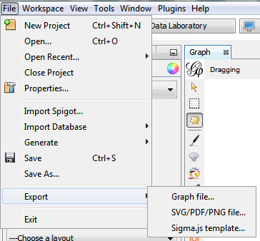
Initially we started off with Gephi, an open source network visualization tool. A real handy tool that can visualize as well as measure the network using various well-known algorithms. Once you've loaded in your edge list and ran your calculations - you can export it out to various format. My favourite in this case would be the 'Sigma.js template' (based on the sigma.js library), which gives you a navigatable (is that even a word? lol) network which you can click and zoom and basically impress others with. A working sample can be seen here.
In my next post, I'll be writing more on visualization the same for dashboard - in particular, Qlikview.
The last couple of months me and my colleagues were working on social network. Basically trying to understand how the subscribers are interconnected and identifying who are the influencers for targeted marketing - or so we thought that's how it should be.
Business justification aside - it was an interesting topic to dive into. After a few days, we managed to come up with our edge and node list, and later ran a few centrality algorithms to measure each individual within that network. Specifically, we were measuring:
- Degree - The number of direct connections that one has. ie How many direct friends does he have?
- Closeness centrality - How close (by means of hop) is a person to each of the person in their network?
- Between-ness centrality - Identifying who acts as the gatekeeper in most of the connections within the network. Who is in-between?
- Eigenvector centrality - Who's the most important person in your network? A person who's directly connected important person would also likely have a high score as well, even if he doesn't have many friends.
I guess it really depends on what you want to do with it. Are you simply just demonstrating an idea? A one-off presentation? Or maybe have them shown in a dashboard?
For us it was all of the above.
Initially we started off with Gephi, an open source network visualization tool. A real handy tool that can visualize as well as measure the network using various well-known algorithms. Once you've loaded in your edge list and ran your calculations - you can export it out to various format. My favourite in this case would be the 'Sigma.js template' (based on the sigma.js library), which gives you a navigatable (is that even a word? lol) network which you can click and zoom and basically impress others with. A working sample can be seen here.
In my next post, I'll be writing more on visualization the same for dashboard - in particular, Qlikview.

Comments